Table of Contents
About the project
Results
Strategic Thinking
Understanding the User
Designing
Usability Study
High-fidelity Prototype
About the project
Mobile App Design
Problem Statement
How to make increasing productivity not feel like a chore?
Role
– Solo UX Designer (Figma design)
– Timeline: 8 weeks (03-05.2022)
– Platform: Mobile
Challenges
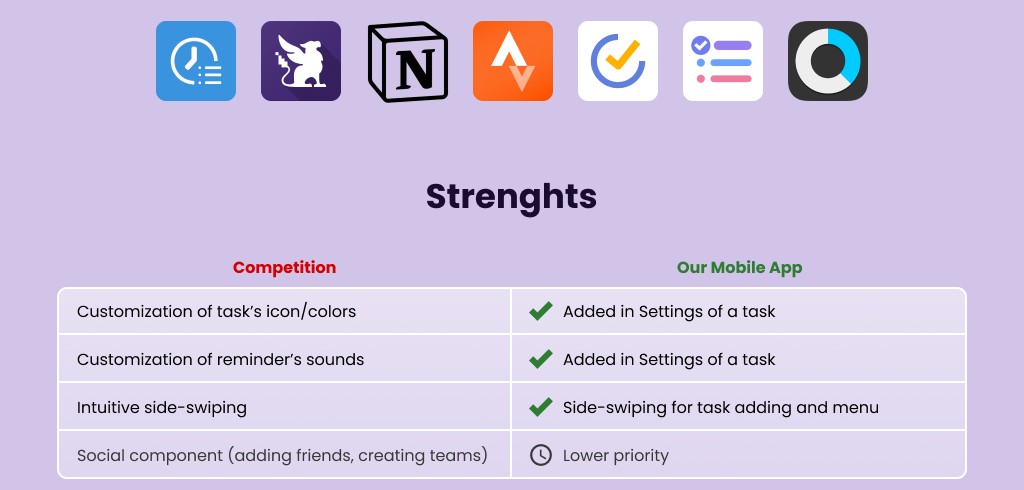
– Huge competition in productivity field (Notion, To-Do List, Tick Tick, Habitica, and more)
– A lot of misconceptions on the internet about productivity which may influence understanding of the mechanisms used in the app
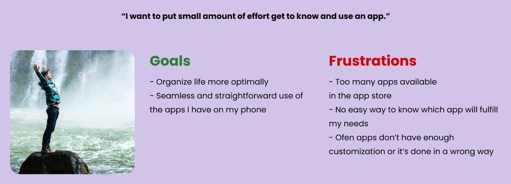
– Users don’t want to put effort to learn new apps
– Some of the ‘productivity hacks’ might seem very basic, which may make it hard to convince users that it works
Results
– 5 out of 6 users rated 4/5 their confidence in using the app after first use
– 4 out of 6 users found the idea of apppreciation to not be a burden at all (score 1/5)
– 3 out of 6 users rated 4/5 their readiness to use the app frequently
Strategic Thinking
– Sparking inner kindness and appreciation for your own effort are the main goals of the app. A permanent change of the inner monologue in the user’s mind is the next step in using the app/website consistently.
– Articles in the prominent space in the menu are meant to be a statement. They allow for a deeper understanding of how the user can use their every single action in everyday life as leverage. Articles are meant as inspiration and as journey guides in increasing productivity.
– The main colors have been chosen light and bright. They are supposed to be experienced like a child from pre-school has drawn them – cause the app is supposed to communicate with the inner child of the user. Using the app is supposed to be fun and feel like a game.
Understanding the User
User Research
Persona
Competitive Analysis
User Research
– 11 user interviews were conducted
– 5 out of 11 users use only pre-installed apps for productivity, like calendar, notes, and alarm as reminders
– 5 out of 11 users mentioned don’t like too many notifications/reminders about tasks cause they start to feel like they are commanded to do tasks and their life is in the hands of the app
– 4 out of 11 users would like a reward system like badges, achievements, milestones
– 3 of 11 users mentioned they enjoy progress bars, charts, and weekly comparisons to look at how much they have achieved
– 3 of 11 users would like customization of sounds and colors of the reminders – so that it would be clear which reminder means what action without having to have a closer look at the notification
What it means for the App?
Big part of the market is not convinced to use those apps yet
Simplicity will drive new installs and reduce churn
Customization needs to require very low mental effort
Competitive Analysis
Designing
Low-fidelity Prototype
Usability Study
Recommendations
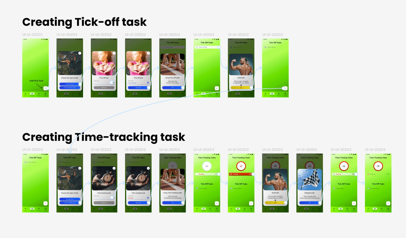
High-fidelity Prototype
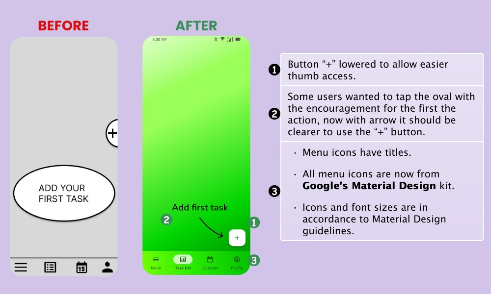
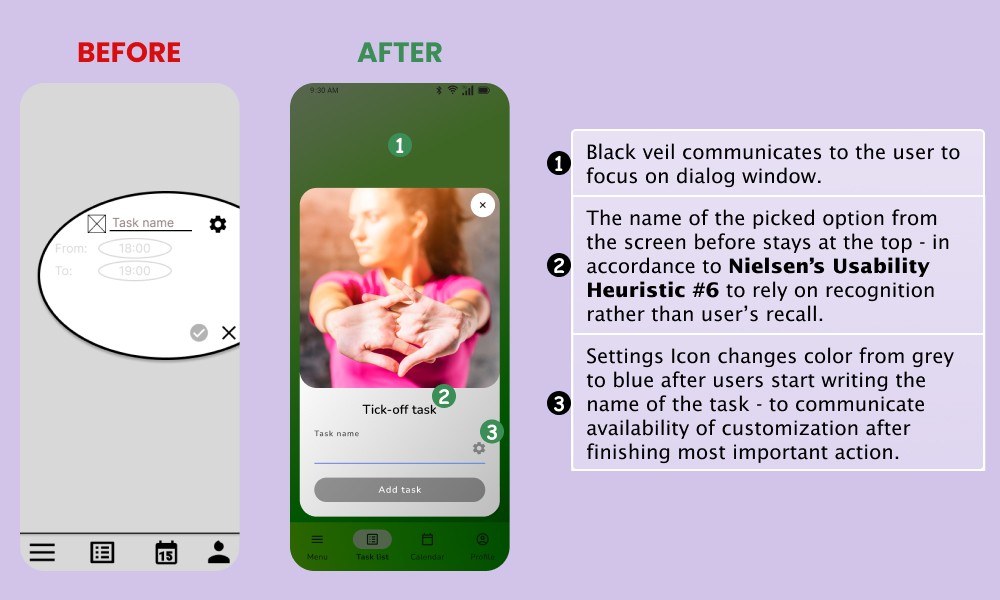
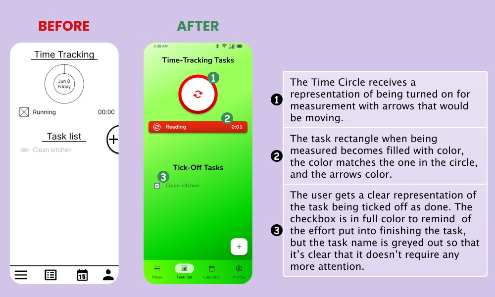
Explained Changes
Low-Fidelity Prototype
Click the image to enlarge
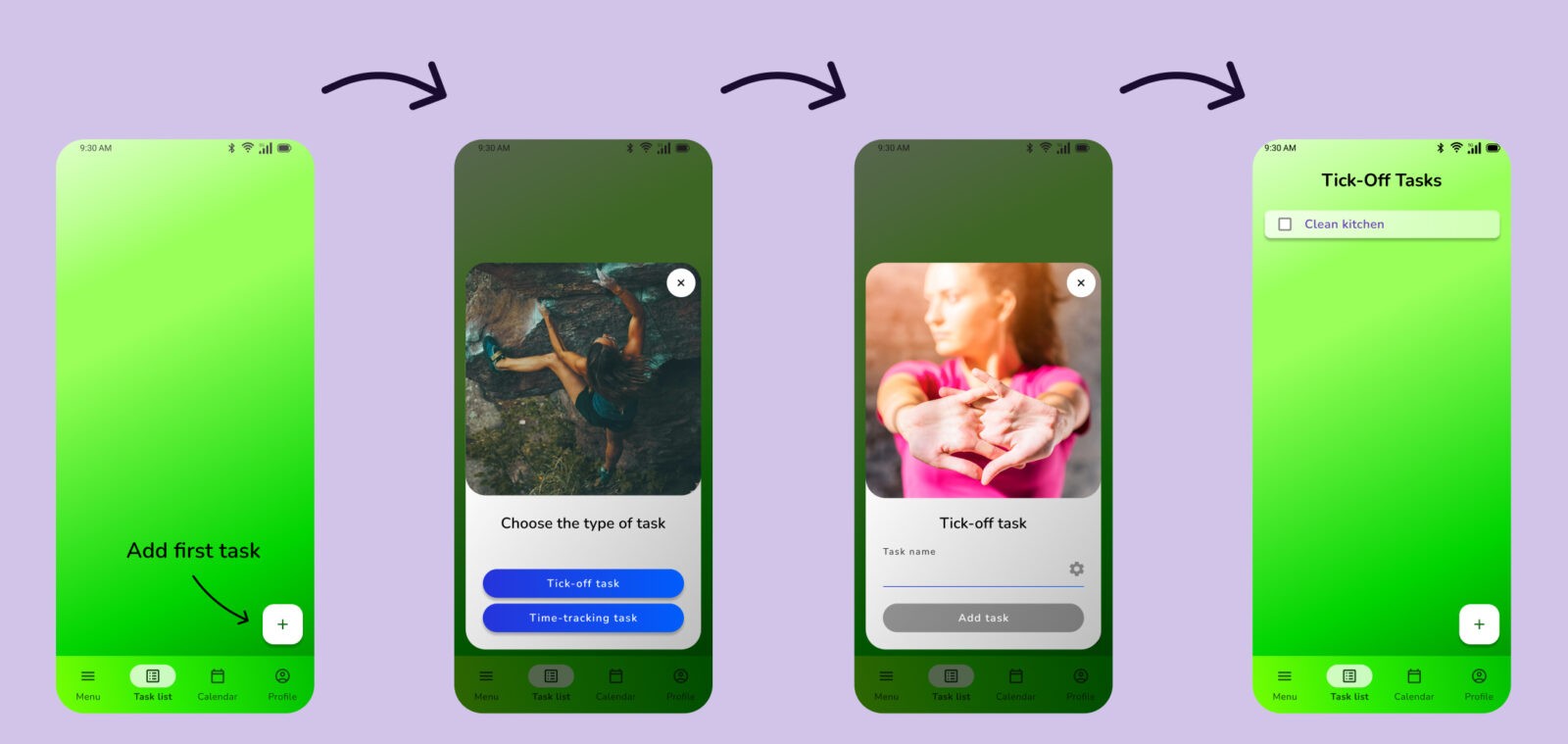
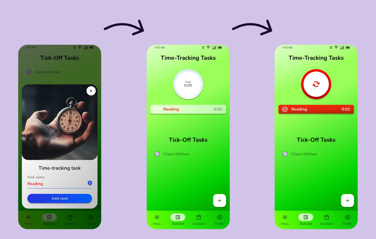
– The ovals and round shapes are supposed to make an impression of a light/breezy mood and make the app stand out
– Small amount of options per screen
– Customization available after most important settings are set
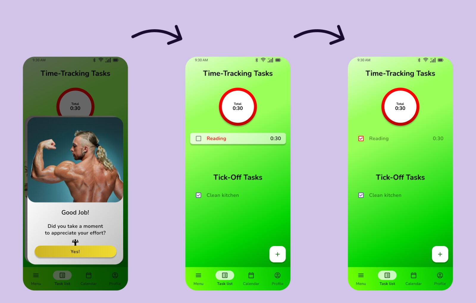
– System messages and outlook of finished tasks reinforces the satisfaction of putting in effort
Usability Study
Research Question: Are there parts of the user flow where users get stuck?
Study specifics: 6 participants, moderated study, done remotely.
Study Execution: After giving a short (~A4 page) introduction about the study, how it will be conducted, and participants’ rights, three tasks were given (one by one) with follow-up questions. Additionally, a question was asked about general thoughts about the app. The study ended with the System Usability Scale (12 questions) in a Google Form.
Working with gathered materials: Note taking spreadsheet -> Affinity mapping -> Insights identification -> Pattern identification -> Prioritized insights.
Research insights
First screen is not clear enough
Users want to be able to click the „Add your first task” oval
Time tracking circle has too many meanings
Users need more clues to understand what the time tracking circle is
Time tracking process not easy to understand
Users need more guidance in how to use time tracking circle
Recommendations
– The “Add your first task” message needs to be clickable or changed
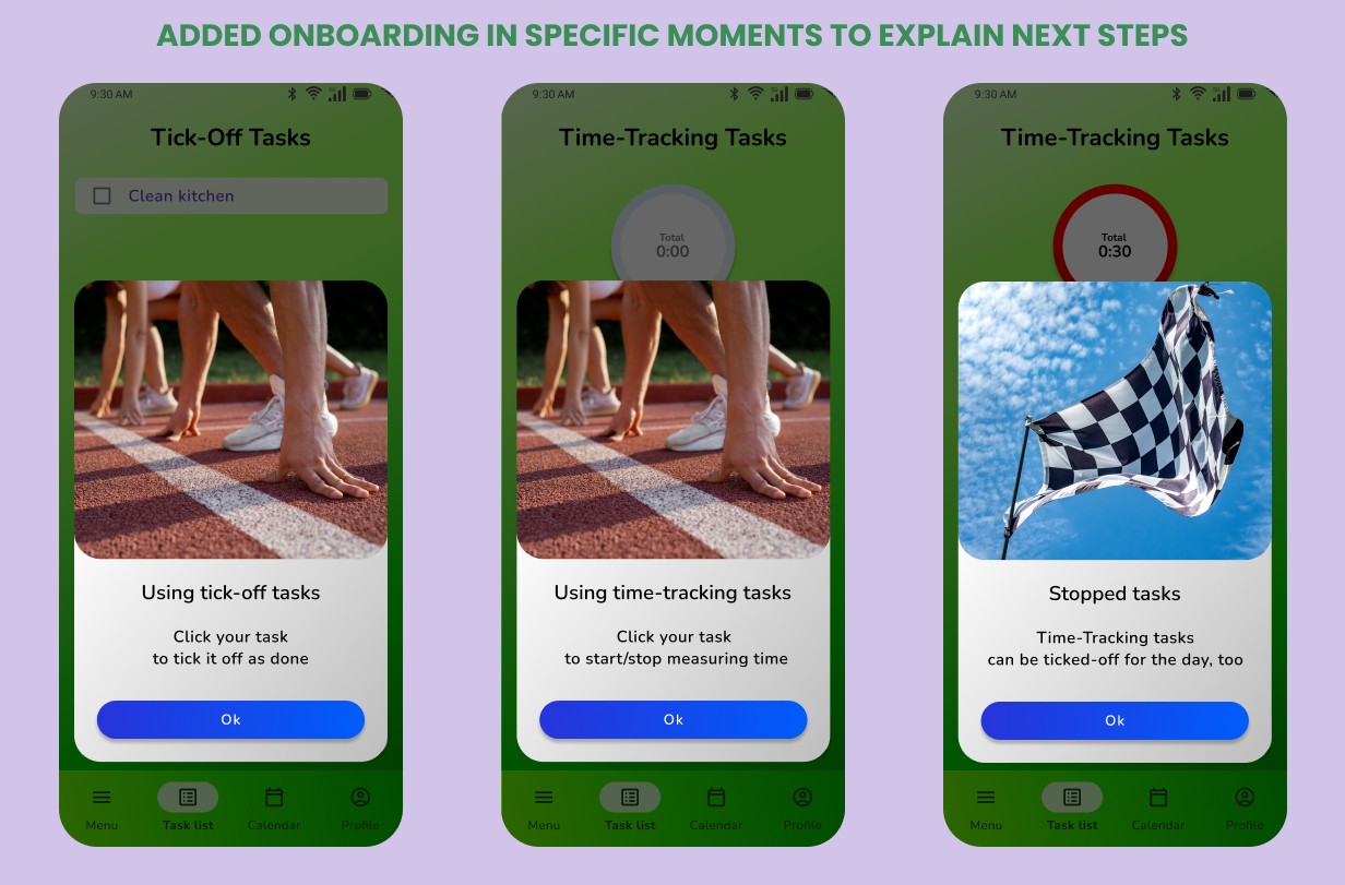
– Onboarding messages needed
– The time-tracking process needs to have more steps
– Menu icons need to have names underneath them
Results
Next case
Maximizing Revenue for a Landing Page
(Desktop, Order Sequence, Selling Paintings)
About Me
Summarized About Me
Advised L'Oreal and Colgate on Digital Strategy/Digital Media
4 years Full-Time as a Digital Communications Planner
2 years Freelancing in UX Design
Digital Marketing Qualification Certificate (DIMAQ)
Google UX Design Professional Certificate
Master's Degree in Psychology
3rd place in a 👨🚀NASA contest for 7 chosen participants to redesign parts of a Drone Interface
Testimonials
“Great communication and timely deliveries, would highly recommend”
“Every line item comes with an explanation – Great.
Easy to work with.”
“Thanks Andrew, very prompt, reliable and good expertise.
Will hire again.”
“Andrew is very knowledgable with his CRO analysis and feedback, we will be using his services again, no doubt”
“Andrew did a great job, very strong of UX/UI and quite professional. Highly recommended!”
“Great, great guy to work with, thorough and detailed in his approach. Do not hesitate to hire him”
“Andrzej was great to work with. He is communicative, prompt, knowledgeable. He is open minded and agile in his work style. I will definately re hire him.”
“Andrew is one of the most hard working professional freelancers on this platform. If you want a UX/UI audit, he is your best bet.”
“Andrew is a great freelancer. He sent me all the deliverables well in time, and he went above and beyond what was requested of him. Highly recommended.”
“Super organised and a really great person. His productivity is so high and has great insights. If you are considering hiring him, please do not hesitate. Go ahead and hire him, you will not regret it!”
“Very reliable, responsive and knowledgable. It was great working with Andrew and I’m sure we will collaborate again soon.”
“Working with Andrew was great. He was fast to respond and made some significant recommendations to our UX which were very valuable.”

